
If you’re a working parent, you likely have battled procrastination during back-to-school time, and probably all year long. The supply list sits on the counter for a week, untouched. Last year’s clothing hangs around a bit too long. And the beach weather outside may be calling!
This is similar to the reason that people aren’t finishing the checkout on your website!
They are both forms of procrastination – so, to overcome this problem, let’s learn from those who help people who struggle with procrastination a lot: people with ADHD. Let’s see how professionals help these procrastinators overcome it to help you have a more successful website and family morning routine!
Jessica McCabe, creator of the YouTube channel How to ADHD, has a name for the extreme version of this: the Wall of Awful. It’s the pile of past frustration that builds up between a person and a task, until even something small feels like something you just want to do later. The sun is shining and sitting by a lake sounds so much easier! She talks about it in the context of ADHD, but it pertains to your business website too: a similar wall stands between visitors and your website.
“A form that felt long, a process that felt unclear, a step that gave an overwhelming amount of choices, a page that didn’t clearly say what to do next.
That’s a wall.”
Think about the last time someone landed on your site to book a service, request a quote, or make a purchase, and started the checkout but left without completing it. Often, this happens because something added friction between them and the action: a form that felt long, a process that felt unclear, too many choices, a page that didn’t clearly say what to do next.
That’s a wall.
And, no, the fix isn’t a supersized call-to-action button or large, unattractive alerts. It’s removing what is really getting in their way. It’s testing what works instead of guessing.
Tips to Descrease The Wall of Procrastination
Whether you’re getting ready for the bus on a Tuesday morning or making a user-friendly homepage:
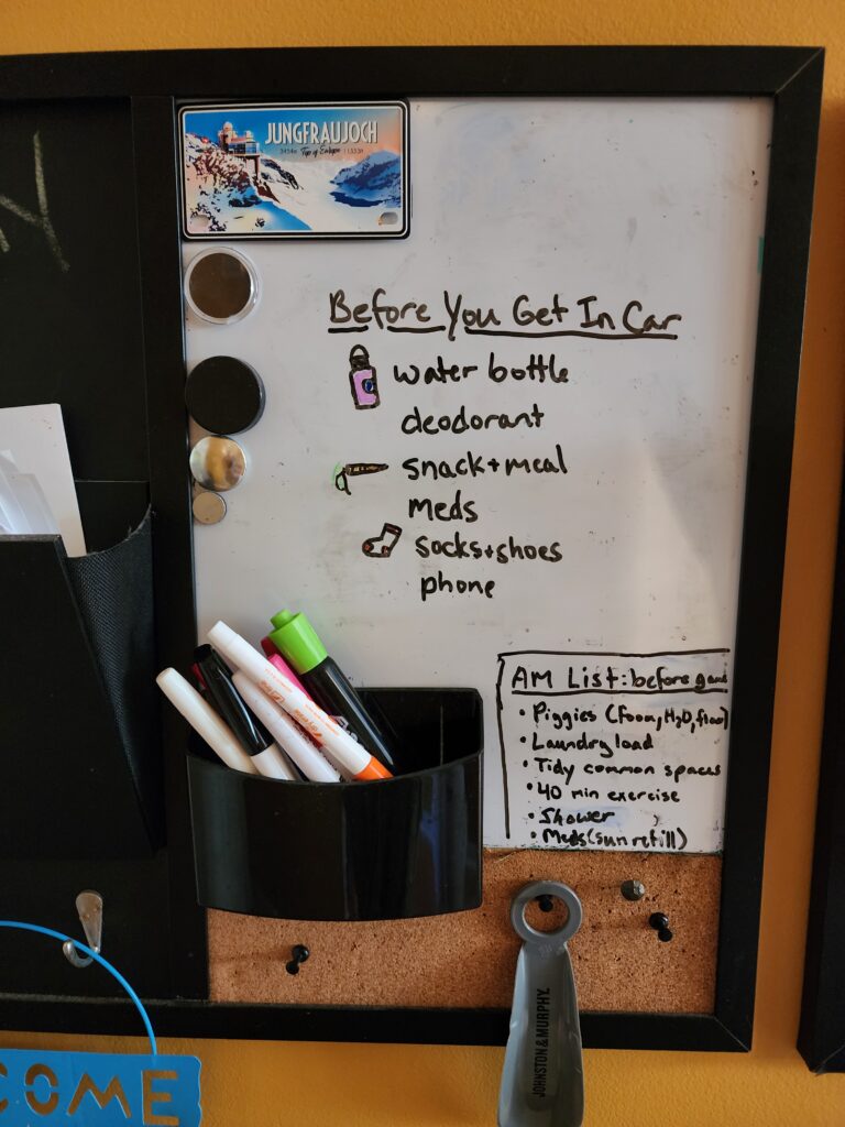
- Boost what’s priority, decrease distractions. On a school morning, have a concise checklist on the door. On a website hero banner, have 1 clear headline and 1 obvious next step, not five competing offers.
- Shrink the task. “Get ready for school” is really a dozen small steps. Breaking a long list into groups makes it feel more doable. A “Hire Us” ask is like that too. Good User Experience (UX) design breaks a big task, like becoming a client, into small, specific, clear steps: 1) Choose which audience you are. 2) Choose a product made for your audience. 3) Fill in three fields. 4) Get a confirmation or followup quickly!
- Reduce the emotional cost. A checkout page that makes sense to you but is confusing to your visitors feels like a small failure to them. Visitors bounce for the same reason kids stall: a task feels too big, and they have other things they’d rather be doing. User-friendly design, based on UX research, helps give them the win of a smooth, enjoyable checkout.
This is genuinely the work of UX research: finding exactly where the wall shows up for real people who don’t know your website the way you do, then redesigning the moment right before it so visitors can succeed at your top goals. It’s just like giving a kid a simplified list to check off at each location where they need to get ready. Chunking a big list into smaller groups, like bathroom, bedroom, and kitchen, makes it feel more doable.
A short checkout form that only shows a few fields at a time feels so much more doable to a visitor. And it happens to be one of the most reliable ways to turn a website visitor into a customer.
Try It
- Pick one goal action on your website that you want visitors to take (register, buy, contact us).
- Count how many steps stand between landing on your site and completing this task.
- If it’s more than 3, there’s probably a wall to lower. It’s time to shrink the task.
This is exactly the kind of friction we look for when we design a website. For things more complex than the above, we don’t just guess what’s easy for your client, instead we research using real diverse people and website data to find the step where someone hesitates, then we help you simplify or remove distractions.
Ask Avosette Marketing about the ways we can help you find a wall in your website flow with our User Experience (UX) services.
Sources: “Why Is It So Hard to Do Something That Should Be Easy? (Wall of Awful pt. 1),” Jessica McCabe, How to ADHD, created with Brendan Mahan (youtube.com/@HowtoADHD); How to ADHD: An Insider’s Guide to Working with Your Brain (Not Against It), Jessica McCabe (2024)